
So you have launched a subscription services business. Congratulations. But that is not the end of it. Next step recommended for your kind of business is a targeted website design and interface for maximum conversions. Well, to get people who visit your subscription focused website actually buy your subscription box demands a lot more efforts than a regular eCommerce store.
If you have an online subscription box store that lacks in offering seamless subscription-focused shopping experiences for your customers then it is a reason to worry about — as it can hinder profits of your subscription business badly.
This blog has not been written to frighten you, it is a guide to a perfect website design so you achieve maximum subscriptions. Some processes are instantaneous and just a look is enough to reach to a conclusion or trigger a decision. Similarly, when a person visits your online subscription store, the first thing that captivates attention is the user flow, interface and precisely, the website design. His perspectives about your business are purely the impressions your website design leaves on him. Therefore, it is important to design a beautiful website — so much so that it keeps your visitors hooked and maximizes your subscriptions.
So how do you setup a subscription box website for maximum conversions?
In the blog, we will cover the following steps:
- Use the design that reflects your brand values
- Don’t overcrowd your website, leave enough white space
- Be precise with your offers and choices
- Align your primary elements better
- Ensure faster site speed
- Color and contrast your website suitably
- Try grouping similar elements into similar groups
- Reduce the resistance of your visitors
- Analyze user’s behavior and flow
Step 1: Use the design that reflects your brand values
Design a crystal clear layout to manifest the right elements just at the right places. The idea is to make your online subscription business store recognizable and impactful right at the first look. The key is also to highlight the features that make your business unique when there are already many others offering similar product(s)/service(s) in the market.
Make sure your subscription box website includes all of these components so it takes you ahead of your competitors; it should:
- capture your unique subscription box concept.
- reflect your subscriber’s persona.
- resonate with your potential customers.
#Key: Get a professional logo, write brief but distinct descriptions, and add high-quality product photos, and these should be incorporated into the design of your subscription site in such a way that they emerge on visitors mind as a unified brand image.

Step 2: Don’t overcrowd your website, leave enough white space
In order to increase the engagement on your website, make sure you leave enough white space on your website. If there is a lot of unimportant content (visual or textual) on your subscription store’s homepage, it would hide from your visitor the more important stuff and leave them unimpressed.
Benefitting from padding and margins, you can easily create spaces between elements like texts, images, calls to action, forms, etc. So leave as much white space as possible on your website and make it look more intuitive.

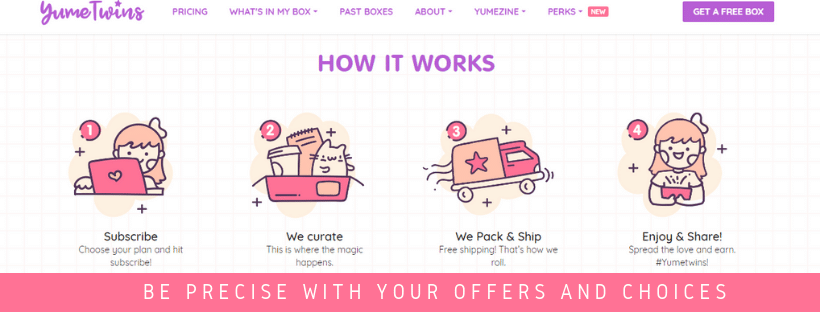
Step 3: Be precise with your offers and choices
It is extremely important that you don’t stuff your subscription website with plenty of choices and options that you offer to your customers/visitors. It negatively impacts your business, as visitors either don’t reach a conclusion or are too confused to choose from various options. And as a result, your potential customers find it easier to leave your site than stay.
So be specific with what you offer your potential subscribers — so that they are guided and hand-held to make a decision just through your UI and user flow.
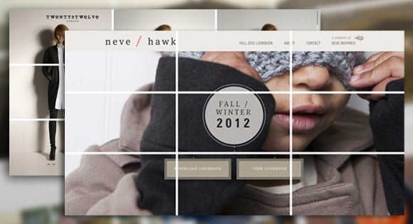
Step 4: Align your primary elements better
According to the rule of thirds, it is crucial to display primary elements on points of intersection between horizontal and vertical lines. What you have to do is draw two equidistant lines, horizontal and vertical.

The points of intersection are points our eyes naturally fall on whenever a web page is displayed. You can make maximum use of this revelation by aligning your primary elements – such as logo, tagline, description, products, and offers — according to the rule of thirds so that when visitors see it, they start interacting with your subscription box website instantaneously.
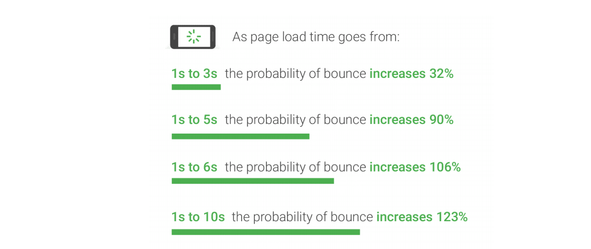
Step 5: Ensure faster site speed
How long your subscription web-store takes to load completely determines your visitors` interest in it.
A research also indicates that 53% of visitors will leave a webpage if it takes longer than 3 seconds to load.
How do you do that?
So, if your subscription box website’s page loading speed is not up to the mark, the visitors will more likely switch to another site (which might be your competitor’s store).
Use free online tools like GTmetrix, Pingdom or PageSpeed Insights to analyze the loading speed of your subscription store, and also how to make them faster.
#Key:One of the most famous methods of speeding up your website is image compression. Once you upload images to your website, the next step should be to compress these images.
Step: 6. Color and contrast your website suitably
Color and contrast are two of the most relevant components of your website. It is through color and contrast alone that you enjoy the freedom to make certain primary elements on your website stand out from the secondary elements. If used properly, it can work in your favor, and increase your conversion rates.
#Key: Get the most out of it by highlighting distinct features of your subscription box so that your potential subscribers see what you want them to see. For example, when ‘Get Started’ or other CTAs stand out from the rest of the content, the visitor is encouraged to act without any distraction.
Step 7: Try grouping similar elements into similar groups
There are two components, Calls to Action and Testimonials. Though apparently separate from one another, they are related still. After all, testimonials inspire visitors to perform Actions faster. By using common colors, shapes and contrasts for both testimonials and CTAs, dissipates the traces of dissimilarity between them and makes them look one unified component of your website, hence faster decision-making from the user’s perspective.
Step 8: Reduce the resistance of your visitors
Change your website design in such a manner so as to capitalize on usually expected customer behaviors. Many times visitors resist because they want a demo or discount, or rather products for free. You can use such expectations to your own end by redesigning your website.
Adding ‘Buy Subscription’ button along with ‘Free Options” manifolds the importance of your ‘Free Subscription’ offer. It breaks down the resistance of your visitors and encourages them to click on your offer right away.
Step 9: Analyze user’s behavior and flow
When you monitor closely, the interaction of your visitors with your website, especially their navigation through your website, it can help you in adding new elements for better conversion rates on your subscription store.
#Key: Take notes on “How visitors navigate your subscription stores”Here’s a graphical representation of the paths visitors took through a website. You can explore it in any Google Analytics report, under the content menu.

Once you have a vivid picture about how your visitors interact with many elements of your website, there’ll be plenty of opportunities for you to redesign or update it more intuitively and precise your elements for faster conversions.
These are only a few Subscription Box Website Hacks for Maximum Conversions but solid enough to skyrocket your conversion rates. Follow these to get better results from your subscription box business, hence making it a profitable venture.
Wondering how to get started for a targeted subscription store design? Or, struggling with Conversion Rates? Reach out to us at hello@mysubscriptionbusiness.com or here, and we will get right back to you. We are the world’s leading Subscription-focused design and technology company helping small and medium entrepreneurs achieve big through their subscription businesses.